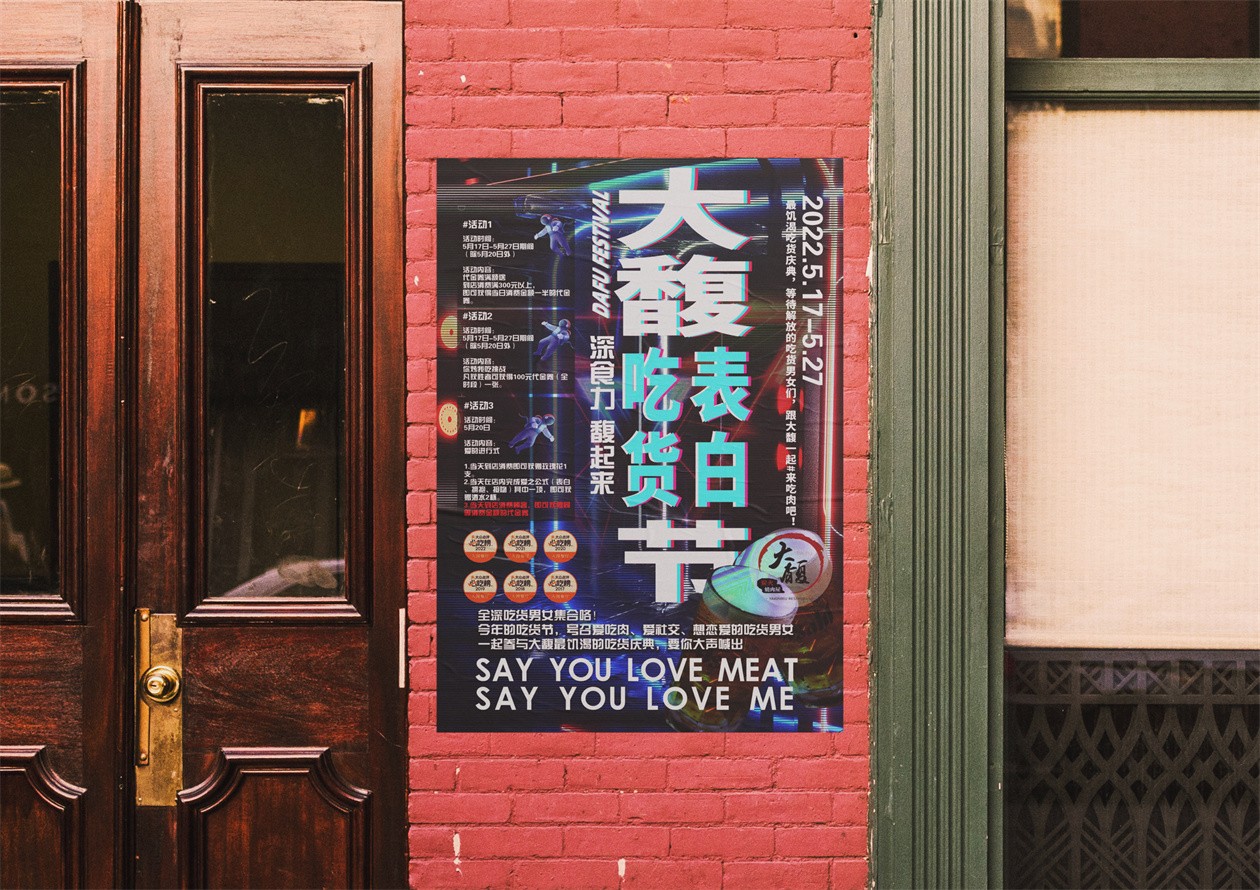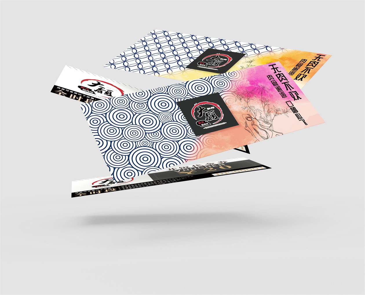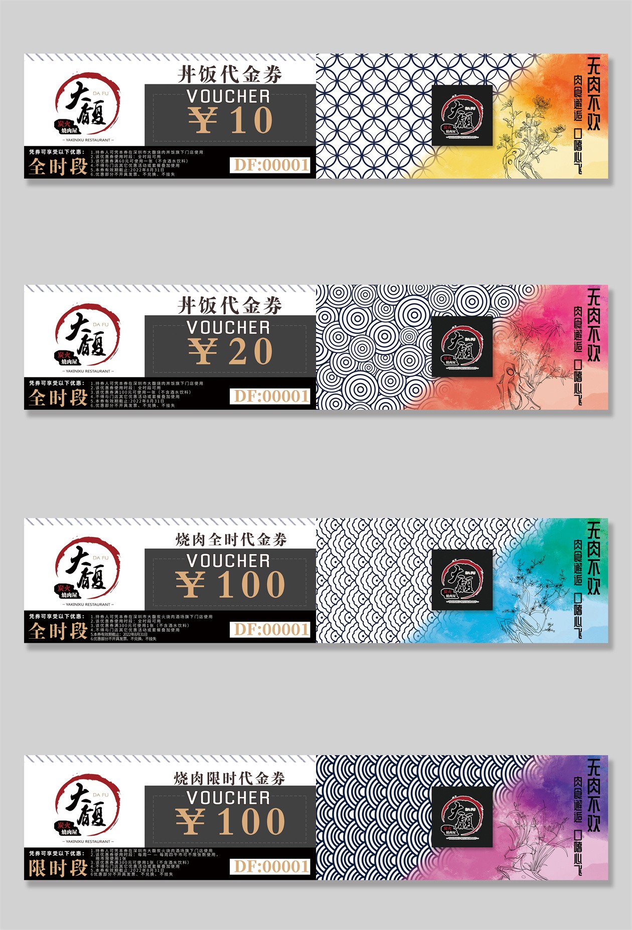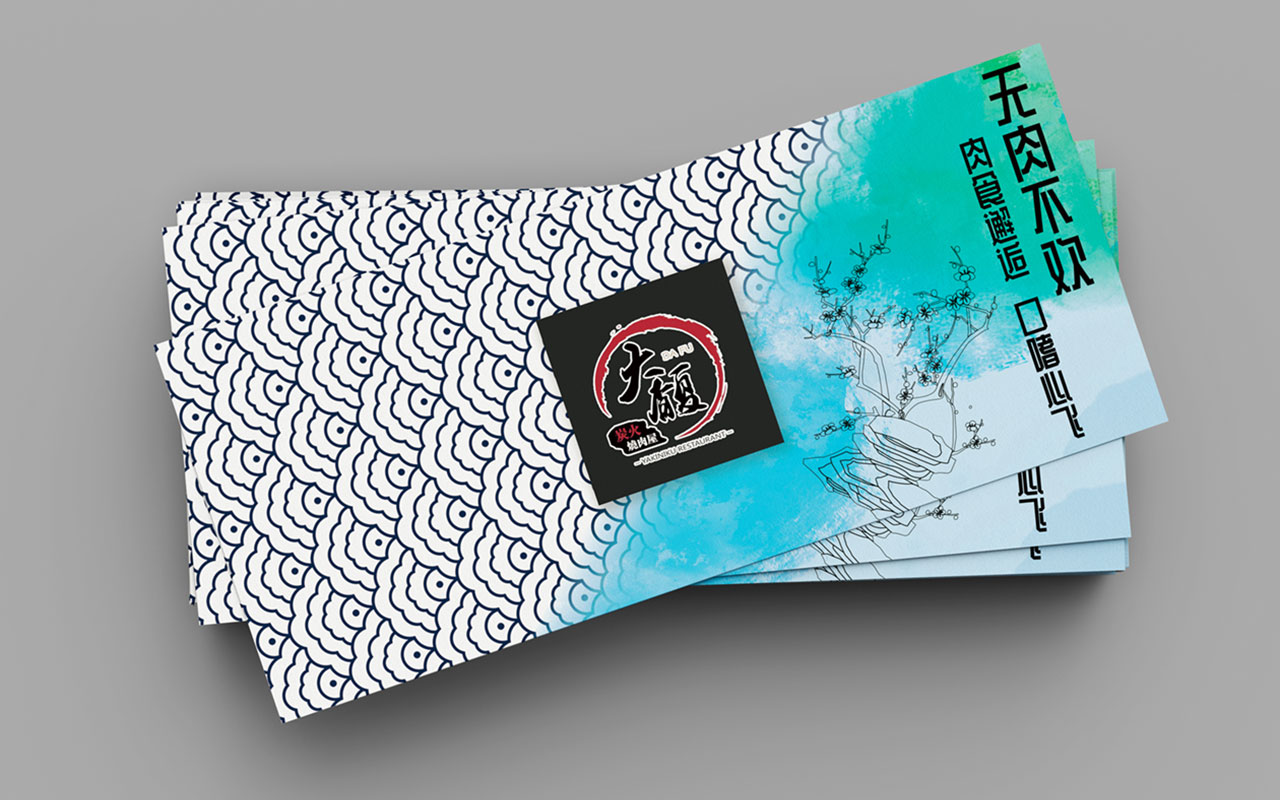
This set of visual communication works consists of a poster and vouchers, mainly used for the visual communication campaign of DaFu, a Chinese local Japanese-style catering brand.
The poster focuses on communicating multiple information and coordinating the relationships of priority. The geometrical Archimedean spiral is adopted to create coherence between graphics and text. Besides, it visualizes the contrasts between distance and proximity, sparseness and denseness, dynamic and stationary, to draw audience' attention. Additionally, the three-dimensional slogans and Cyberpunk elements adopted highlight the theme of this campaign.
The visual design of vouchers integrates Chinese elements and Japanese graphics. On the vouchers are patterns in such shapes as a fan and a shell, all of which symbolize wealthiness. The gradation of colors is utilized to represent the four seasons and echo the representative plants of each season, namely orchid, bamboo, chrysanthemum and plum blossom. The above two subtle designs jointly signify a bonanza throughout a year.
![]()
IAI Excellence Award
Shi Zongshao
China